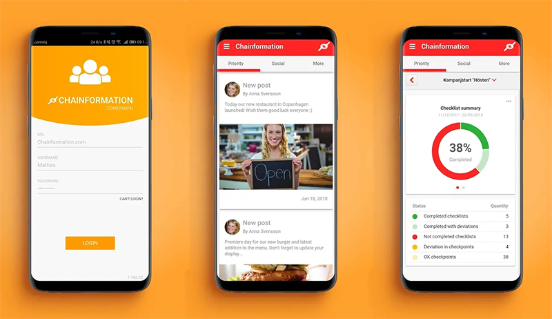
We designed and developed a companion mobile app for an existing web application – a cloud platform used by multiple unit organisations and their employees, for internal communication, onboarding, daily job routines and more.
UX Challenges
The original web application was designed for multiple unit organisations, with a focus on franchises and other companies that share a common concept and management.
It’s designed to work for two or three units as well large enterprises with thousands of units spread out over the globe. Some things in the platform are quite complex and a large part of the product were designed for users with some ”system knowledge”, higher up in the company chain, management basically. A lot of the tools and feautres in the web application were created to meet our customers needs and a large part of it was designed for office people. However, the platform is meant to be used not only by office people but also by all of the employees, who often have very limited technical skills. And since most of the employees work on the floor, rather than infront of a computer, there was a need for a more and simple mobile solution for this type of user.
When floor workers used the standard web application, they felt confused about all the different tools, menus and buttons. And they didn’t know where to go or what to do. Users also felt that they didn’t want to take the time to log in to the web platform unless they knew there was something important to do – news to read, tasks to complete etc.
With good design and UX, we had to achieve the following:
- Deliver a much more mobile and easy-to-use solution.
- Help empoyees stay up to date with what’s going on in the company, without having log into a website.
- Tear down technical barriers that are limiting users
- Make sure users feel like ”home”
Since neither me or the company made a mobile app before this was quite a challange.

UX Solutions
We knew since long that a majority of our end users are less technical – many of them doesn’t even have their own computer. We also know that a lot of them are in the lower age span. So when designing the mobile app, we looked a lot at design standards set by some of the web platforms of today. In order to make users feel like home and recognize themselves we took a lot of inspiration from platforms and apps they are already used to and make sure we stick to modern design trends. This opens up for better accessibility since the interface is more familiar to a wider range of users.
We gathered differet type of information coming from the platform in two seaprate tabs on the home screen of the app – making navigation and orientation easy for users. The most crucial information are always infront of them in the prioritized feed. And they are notified whenever there’s something new to see – no need to ”check in” to see if anything happened.
We also gathered the most common and important tools for most users under a floating action button on the home screen, for super easy access without having to go into the main menu and separate modules.

Final notes
While this was initially meant to be a much more simple product than it eventually turned out to be. It have become one of the companies core products which have have lead to a notable increase of active users in our customer’s applications, which in turn have made it easier for the marketing deparment to get new leads and close deals.
I was the single UX designer working on this project. My work included:
Research
User research – surveys and feedback from customers.
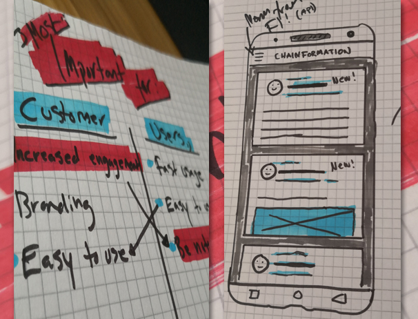
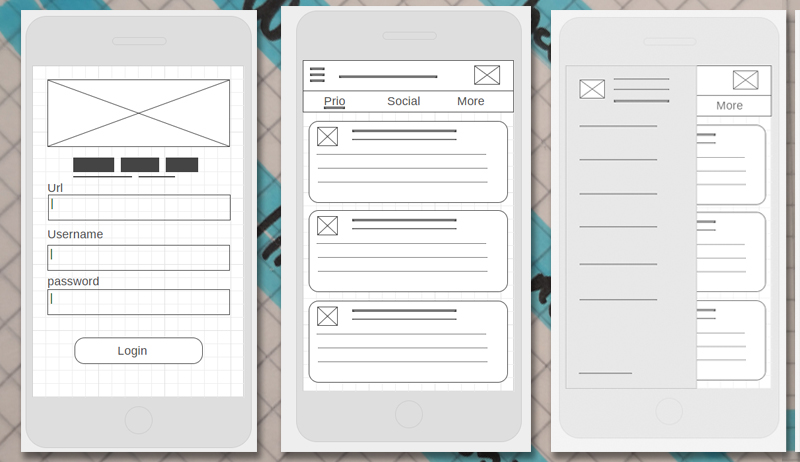
Sketching, wireframes and prototyping
For brainstorming, solution suggestions, feedback and tests.
UI Design and release
Final UI design, user stories and coordination of developers for implementation and product release